Thursday, 27 April 2017
final designs
this is my final design cover, i clearly show the main focus of my magazine, the girl band three, i clearly show two of the members on the cover with their band name as the main cover line in bold green with stylistic font to grab the readers eyes, then below i have added a sub-main cover line giving more exposition in the article, so the readers attention is grabbed but they want to read the article more after seeing the small exposition and clearly show the focus of the magazine. the masthead is clearly visible so the reader easily knows what magazine they are reading. then at the bottom of the cover i have placed more cover lines to give more information on what is in the magazine. the main image is darker in tone so that the writing stands out more clearly.
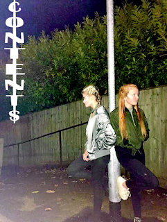
this is my magazine contents page, i have clearly shown the brand names of my magazine so the reader familiarises with the name, clearly given the pages of important stories and actually changed the colour of the font to make important pieces of information stand out. then i have added two photos of the band i am discussing as they are the main focus of the magazine.
this is my magazine double page spread, i have once again added a large photo of my band as they are what the article is about, i have also as the the main headline used a familiar phrase so reader would quickly begin to get the main part of the article (that the band have split). i have used very melodramatic writing and lexis to show the magazine is campy and flamboyant.
Thursday, 9 February 2017
props and costume list
Alex
for alex i had limited props and a simple costumes, which was a khaki bomber jacket,a grey crop top and black jeans. i wanted the costumes to be simple as the band weren't eccentric with their outfits and wanted the girls to appeal more to the audience by wearing popular trends and outfits.
Ella
i wanted my audience to resonate with my model so i wanted my models to dress with average stylish clothing as it would be something my target audience would wear and would engage with. so ella ore a shiny silver bomber jacket, a sequins green jacket and black jeans.
Lillie
clothing was important for my front cover as it would be the factor to engage my audience with my magazine so i needed my models to wear popular clothing brands like topshop or next so it would easier for my audience to be drawn in. lillie wore a white cap, a puffer jacket and black jeans.
documenting my progess


First attempts
these are my first attempts with photoshop, starting i had little knowledge of photoshop and how to use it. so i had to learn what each function did and how i could help me make my ideal magazine covers. there is little editing to the photos as i wasn't aware of many techniques for photoshop so these are very basic, i played around with contrast and lighting also making the image shaper. In the other example you can see i have added filters over the photo, this is a very basic skills but the final products i was satisfied with and began my on my way to using more complicated photoshop.
Second attempts
these are my second attempts at photoshop where i have used more complex methods of doctoring the images using photoshop, i have drastically altered the background and added non-natualistic styles to the cover so that it would be more interesting than a dark background. I have also inculed typography to get on the right trak to making my magazine title and the fonts and position i want it to stand. these more complicated attempts at photoshop have given more ideas of what i want to incorporate in my front cover.
Wednesday, 8 February 2017
Wednesday, 1 February 2017
Tuesday, 31 January 2017
Wednesday, 18 January 2017
Tuesday, 17 January 2017
Monday, 9 January 2017
Subscribe to:
Comments (Atom)


